Replacing a multi-iteration physical sample process with a real-time 3D editor
Role
Lead product designer at DD. NYC. Owned discovery, UX strategy, information architecture and the design system from blank slate to production specs, with one intern under my direction.
A project manager, our creative director, our agency’s CEO (final approval and active involvement throughout), and an embedded engineering team. The intern worked under my direction across the full project.
Problem
Custom apparel at VF Corporation required costly physical sample rounds, slow multi-party approvals and manual sketch-to-production conversion. Every project lost time and budget to the process rather than the work.
Solution
A real-time 3D apparel editor: high-fidelity material rendering, shared annotation and approval, multi-garment collection view, and automatic production-layout export.
Outcome
Sample rounds per project 4–6 → 1–2. Approval cycle cut by half or more. Sketch-to-production conversion automated. New designers productive in under a day. Shipped for Vans, then Timberland and The North Face.
The problem worth solving
VF Corporation — parent of Vans, The North Face, Timberland and JanSport — sells custom apparel to internal brand launches and corporate buyers like ASOS and Yoox.
The legacy process had no intermediate 3D step. It jumped from 2D sketches straight to manufactured samples. Sketches can’t convey a real garment well enough to approve, so confidence had to be bought with a physical sample every round — typically 4–6, logistics compounding each time. The bet: replace most of those rounds with high-fidelity digital mockups.

The custom-batch creation process at VF, before launch.
ASOS places a custom shoe order with bespoke colorways. The brief moves to Timberland’s design team, who produce an Illustrator sketch. ASOS sends it back with notes. Iterate, typically across four to six rounds. The buyer is reading a 2D sketch and trying to imagine a 3D shoe; the designer is interpreting written feedback and trying to imagine what the buyer wants.
Once design locks, physical samples are produced and shipped, then more approval rounds. Logistics charges accumulate. By the time production begins, much of the original budget and timeline has gone to the back-and-forth, not the work itself.
Discovery
Interviews ran sequentially — executives, then designers, then engineering — so each stage deepened the picture. I interviewed 20 designers, roughly 70/30 internal VF to corporate-buyer teams.
Three findings drove everything after. Designers live in Illustrator and customise it heavily in different ways, making personalisation a requirement. Approval spans multiple stakeholder levels, mixing async review with in-person presentations. Designers compare pieces while creating, not only at review.
Executive interviews: goals and the scalability constraint
Executive interviews established business goals and identified the two primary user groups: in-house VF designers across multiple sub-brands, and designers on corporate-buyer teams.
One tension surfaced early. The app had to serve meaningfully different design environments per brand — Vans skews footwear, others skew apparel — from a single application. Scalability across environments became an explicit constraint from day one.
Their success framing: speed up apparel creation, digitise as much of approval as possible, reduce cost. They also flagged approval dynamics, often by sharing the actual presentation decks they used for internal collection reviews.
How each of the three insights was learned
Illustrator dependency came primarily out of interviews. We then asked designers to send recordings of their actual workflow to see day-to-day use. Muscle memory and shortcuts were prominent, and removing them wasn’t an option. This became the foundation for the personalisation model and the Illustrator-mapped hotkey system. The variance in how designers customised their setups — panel layouts, navigation by visual vs. by code or name — showed up in both interviews and recordings.
Approval dynamics came from interviews with executives and designers, plus the presentation decks they shared. This produced two features mapped to two distinct pains: notes for async feedback loss, and presentation mode for in-person collection reviews.
Side-by-side comparison came up in interviews and was reinforced in workflow recordings, where designers visibly switched between files or opened multiple windows to compare pieces while editing. Comparing to keep a collection coherent while working is a different problem from comparing during review — both drove multi-garment editing.
Participants were selected by VF’s HR, our main communication point throughout, against our criteria of a randomised and representative sample.
Competitor analysis: three gaps we could exploit
I analysed Browzwear, CLO 3D and VStitcher / Style3D, plus adjacent 3D editors like Spline as non-direct competitors with overlapping functionality, looking at layout patterns, tool coverage and assumed workflows.
None offered meaningful multi-garment collection editing. All were designed around the single garment as the unit of work, which doesn’t match the use case our future users reported.
Several were over-engineered for edge-case coverage rather than quick apparel design, requiring deep app understanding and long onboarding.
Layout and tool ergonomics varied widely. Our users are professionals, but the functionality their actual tasks require isn’t as wide as the more complex apps offer. A more complicated interface gives more freedom but makes day-to-day slower and onboarding harder. Onboarding speed mattered here, so this was a real trade-off, not a cosmetic one.
Technical discovery: the constraint that shaped the product
This is a real-time 3D editor with high-resolution assets running in browser, so involving engineering from the start rather than handing off finished specs was essential. That decision prevented several expensive late-stage reworks.
The key constraint: drag-and-drop interactions — both for placing graphics on garments and for drag-to-anywhere panel placement — would have made the app significantly heavier to run in browser. Engineering raised it early. We considered drag-and-drop in both places, ruled it out for the same underlying reason, and worked through alternatives together.
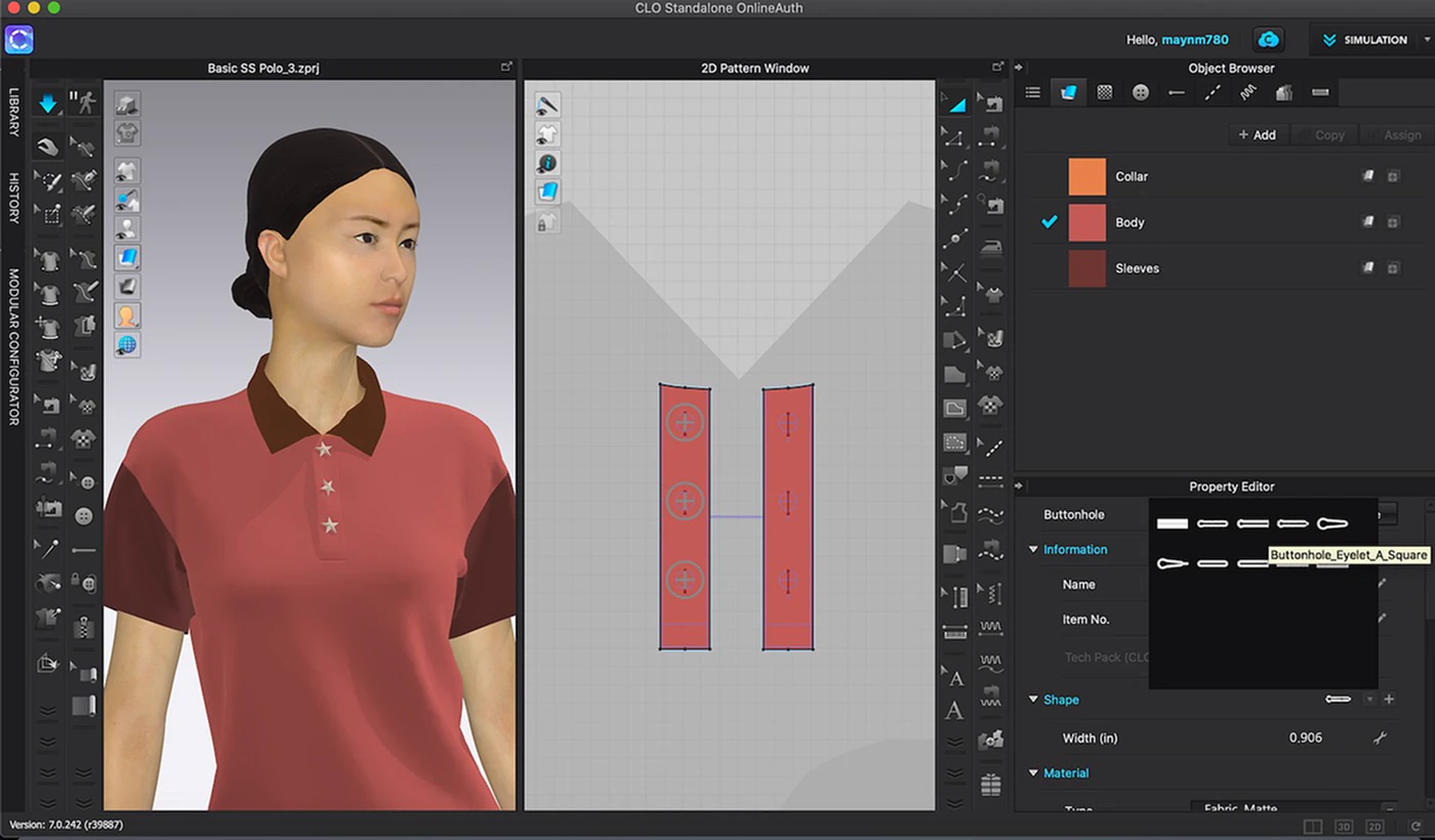
CLO3D interface reference.
How we did research
Research ran across the whole project rather than ending when design started — over 30 sessions in six waves, from layout direction to pre-launch testing on the built app.
Interviews told us what designers said they did. Workflow recordings told us what they actually did. The gap drove most of the iteration.
Interview methodology
We recruited 20 designers through VF’s project manager, who had a participant list ready before we asked; we selected against our criteria. Sessions were 1-on-1, 30–60 minutes, remote via Zoom or Google Meet, with me, the intern and our agency’s CEO present.
The CEO’s involvement was unusual but intentional: we were a small team, this was strategically important for the agency, and her presence made cross-functional communication with VF cleaner from a business standpoint.
We used a structured discussion guide rather than open-ended conversation — current workflow, tool stack, most frequent pain points, patterns they’d worked with. Findings were synthesised in Google Docs, coded by theme and severity.
Workflow recordings
We asked designers to record themselves working on real projects, uninterrupted, at their own pace, shared via Google Drive. We requested specific flow recordings before designing each feature, then ran usability testing on the prototype after the design was drafted. That loop — pre-design observation plus post-design testing — drove most of the iteration.
User testing methodology and how we scored issues
We used the Nielsen Norman Group usability testing protocol. Each session followed the same structure: participant briefing (purpose, think-aloud encouragement, recording disclosure), background questions to anchor context, a realistic scenario, a task list on a Figma prototype, and post-task questions for qualitative reaction.
Example from the Wave 1 layout test. Scenario: you’re working on a custom shoe collection for a corporate buyer and need to start building the design. Tasks: create a new apparel piece from library, open the editor, navigate the parts list, apply a material, change a colour, place a graphic, save. Post-task: which parts of the layout felt natural vs. confusing, which actions took longer than expected, which of the three versions felt most like their existing tools and why.
Every session was recorded. We rewatched to manually track time-to-task-completion, mis-clicks and error rate, and logged self-reported confusion from think-aloud. Issues were scored on the NNG severity scale, aggregated, and applied to the next iteration by severity and feasibility.
Two benchmarks per metric. A rough best-case set against industry standards plus our own estimate of a good outcome — a quality floor, to check the winner wasn’t just the best of three weak options. And the average across proposed options, used to pick a winner among the three in Wave 1. A choice passed a milestone when the winner sat at or near best-case. If it didn’t, we reworked rather than shipped.
Earlier tests ran on Figma prototypes. We moved to the built application once the initial design was confirmed and deployed to pre-production, which caught real performance and integration issues before public launch.
The six testing waves
Wave 1 — layout direction. Three options tested against each other.
Wave 2 — the winning layout fleshed out into a full editing interface, tested end-to-end.
Wave 3 — compare mode, file system and personalisation, tested together because the three are tightly coupled in the workflow.
Wave 4 — onboarding. Wave 5 — pre-production testing of all flows combined. Wave 6 — post-production testing on the built application before public release.
Cohorts were rotated and randomised across waves to keep the sample representative and avoid familiarity effects. Almost every decision in the final product — layout, personalisation, right-panel tools, multi-garment editing, file system — was shaped by what came back.
Wave 1 layout iteration.
What we were really building
The largest source of waste was misalignment: buyers couldn’t visualise designs from 2D, feedback was lossy, approval needed physical artifacts. Onboarding sat alongside it — many users would be buyer-side designers who’d never get training, and if they couldn’t pick the tool up alone, the alignment thesis collapsed on their side.
Four principles, each mapped to a feature: minimise friction (personalisation, Illustrator hotkeys); make reviewing first-class (notes, presentation mode); support side-by-side work (multi-garment editing); make it learnable in a day (contextual onboarding).
Time to complete key flows, physical sample rounds per project, onboarding time for new users, process coverage rate across VF sub-brands, and feature adoption rate as a proxy for actual workflow integration.
Visual direction: where I pushed back
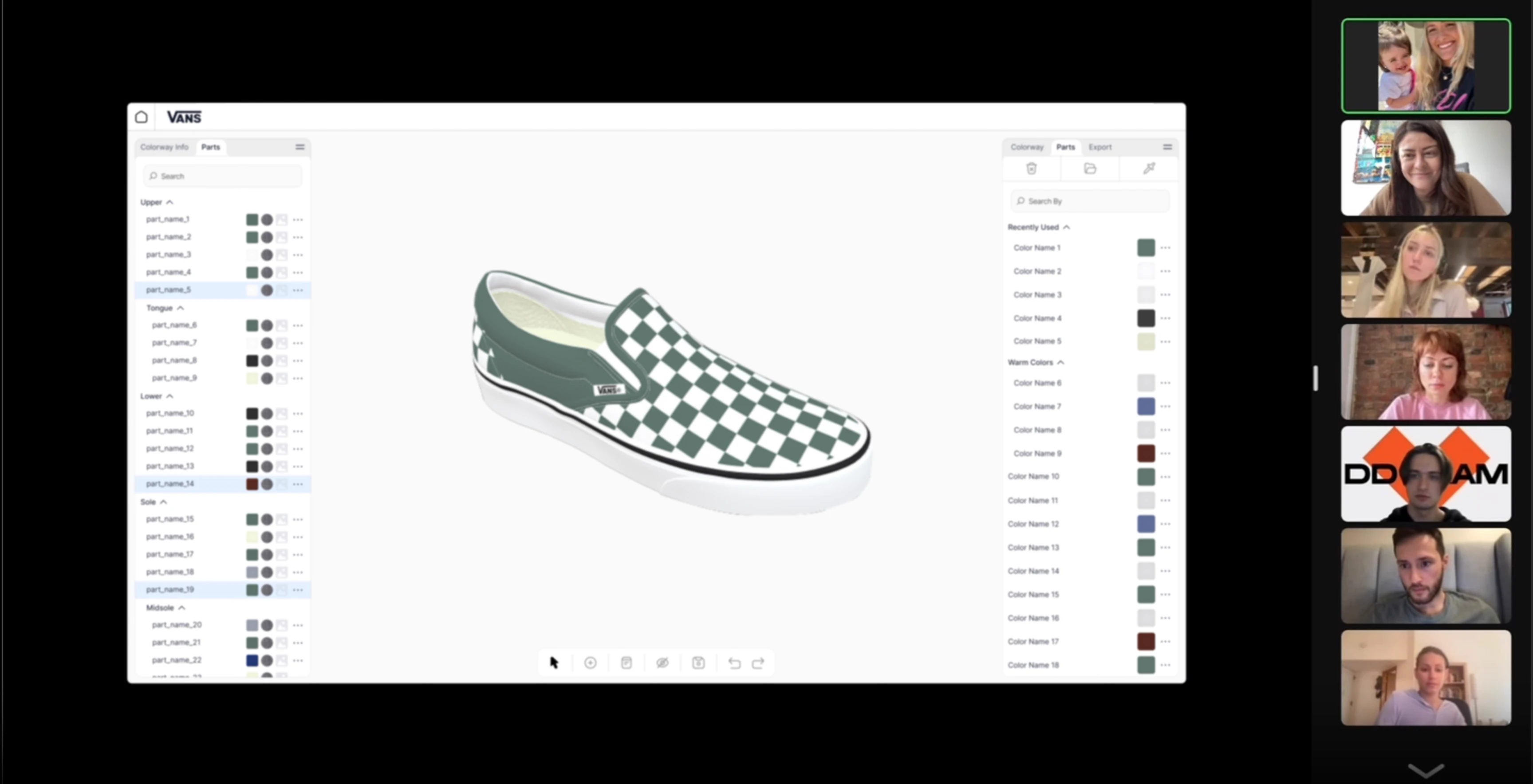
The creative director proposed a minimalist, editorial style. I disagreed: editorial layouts privilege reading, a 3D editor privileges doing. Several rounds of mockups later we settled on cleaner interaction language and more visible controls. Holding the position meant showing the difference, not arguing it.
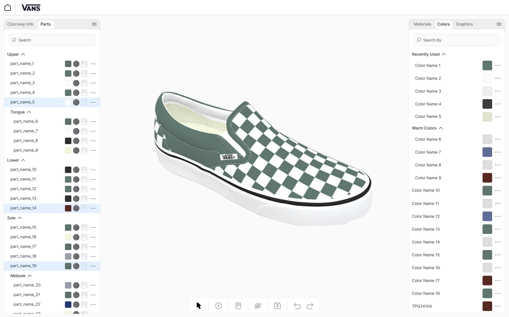
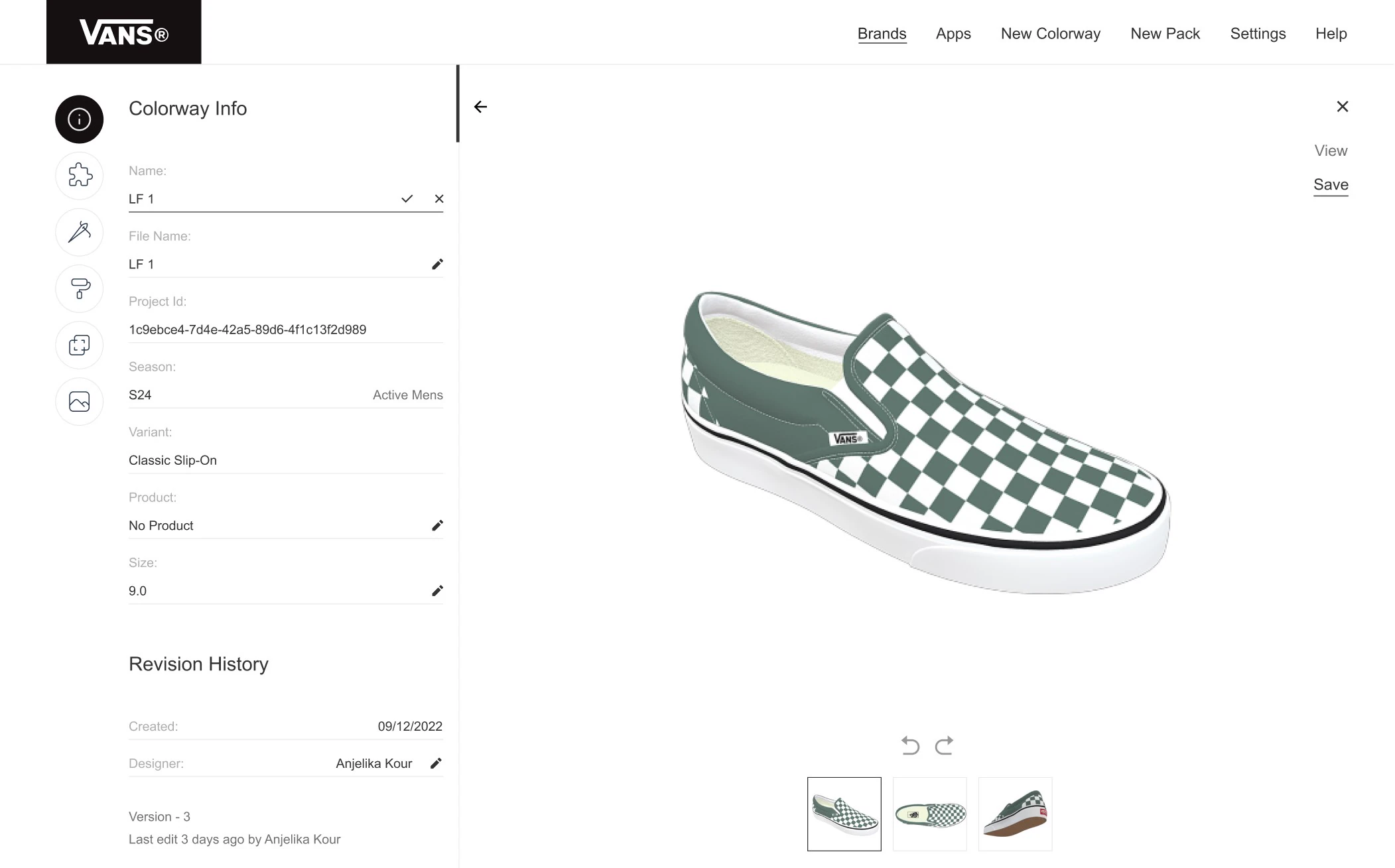
Accepted vs. declined visual direction.
With direction set, we built the system on top of MUI. We chose it because its component depth matched our coverage needs and we had no time to invent base primitives we wouldn’t differentiate on. The differentiation lived in the canvas, not the chrome.
Personalisation: solving the Illustrator transition
Designer variance was wider than interviews suggested — some panel-heavy, some living in shortcuts, some navigating by colour code rather than swatch. One-size-fits-all would have alienated experienced users.
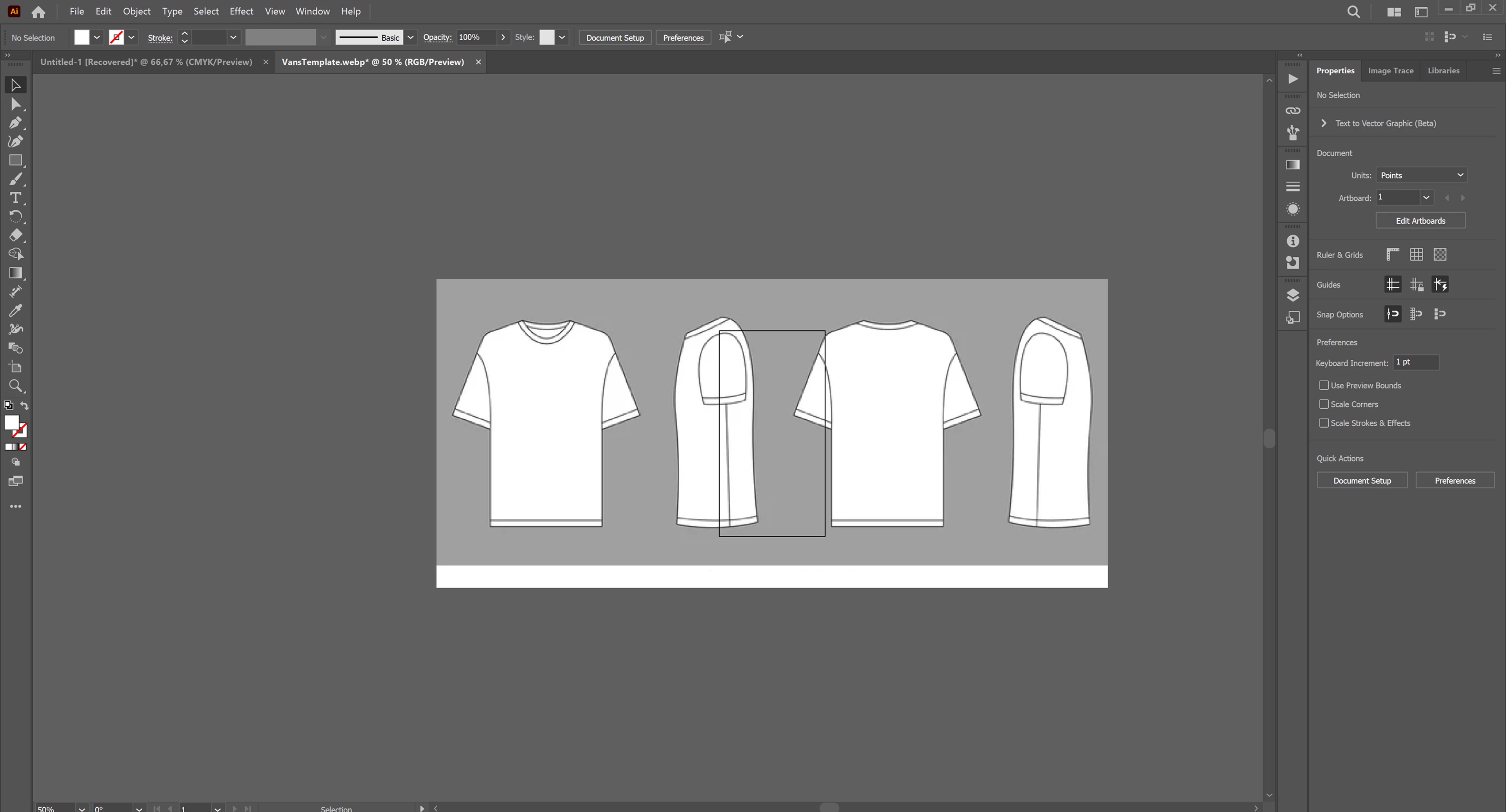
A designer’s own Illustrator setup.
I looked for the smallest feature set covering the most variance: resizable elements using Illustrator’s own stretch interactions, repositionable panels, hideable panels, and a name-heavy / image-heavy toggle.
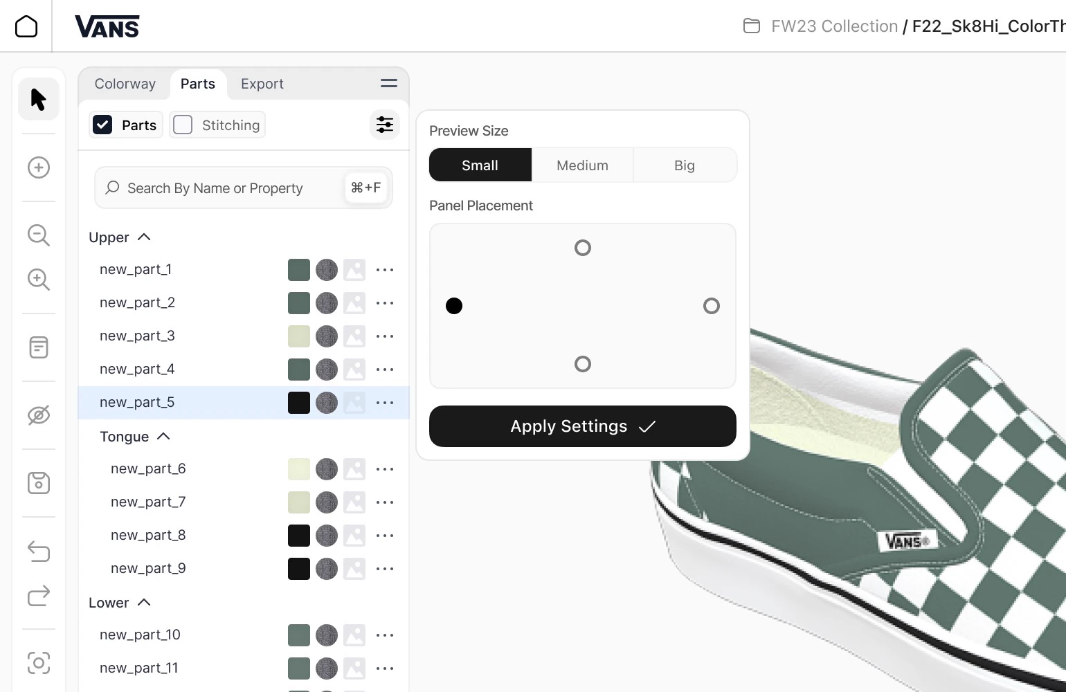
The personalisation model.
We considered drag-to-anywhere panel placement — free arrangement of panels into custom layouts — and ruled it out on the same engineering grounds as drag-and-drop graphics: too expensive to run smoothly in a web app at our target performance level.
The four features above addressed the bulk of the variance I observed without that runtime cost. Getting there took additional observation time (workflow recordings) and competitive review before committing to the model.
The editing interface
Wave 1 tested three layouts: Illustrator’s default, an averaged version of designers’ real customised setups, and our own from competitor research. The averaged real-world setup won — notably, no designer’s actual layout matched the Illustrator default.
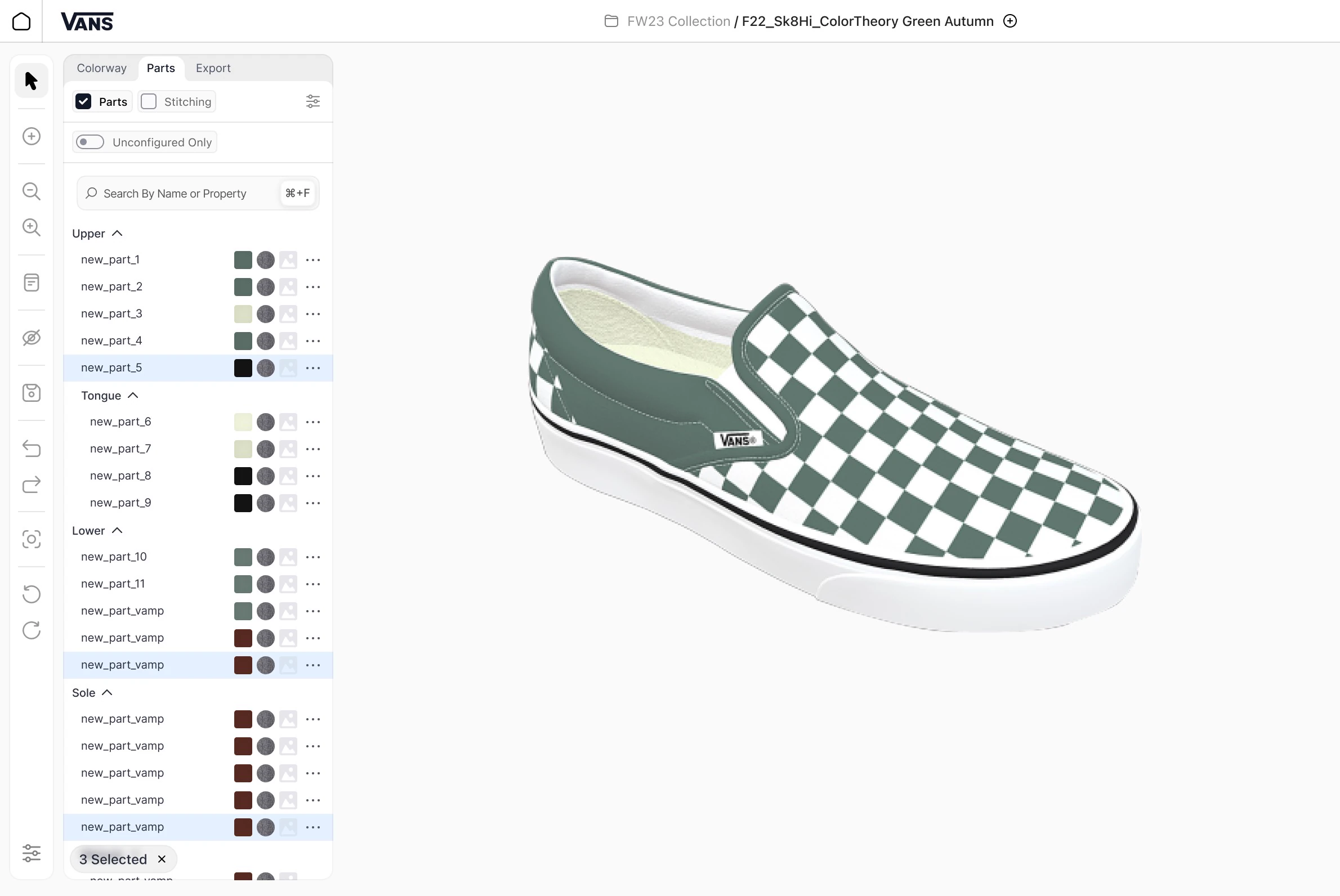
The layers tab.
How the layouts were tested, and how we handled dozens of parts
Each option was tested in a controlled session with 20 designers (mixed in-house and corporate-buyer) on Figma prototypes, with every participant creating a shoe and making at least one edit per category: material, colour and graphic. We measured time-to-task completion, mis-clicks, error rate and self-reported confusion.
Garments carry dozens of parts, many small or visually similar. We added filtering by unconfigured parts (for self-review before submission) and quick-select by matching material, colour or graphic. That came directly from interviews and recordings, where part properties turned out to be a faster identification method than part names.
What we cut: large property previews
The first version of the layers list used large visual previews in each property category. Colours and materials displayed at sizes that emphasised visual identification, matching the discovery insight that designers navigate by visual property rather than part name.
Designers killed it in testing. With 10+ parts per category, large previews pushed the list off-screen and made navigation slower, not faster. The answer was a balance: smaller previews that still supported visual scanning but kept the list scannable at real part counts. We added the preview-size toggle to personalisation, because recordings showed some designers are more comfortable with visuals and some with text.
We held the visual-navigation principle from discovery and traded the specific implementation that didn’t survive contact with real workloads.
The right-panel tools: export, notes, hotkeys, presentation mode
Export supports every format VF and its buyers needed. The unlock was automatic conversion from sketch to production-ready layout, previously a meaningful manual effort per garment. At collection scale the time recovered is significant.
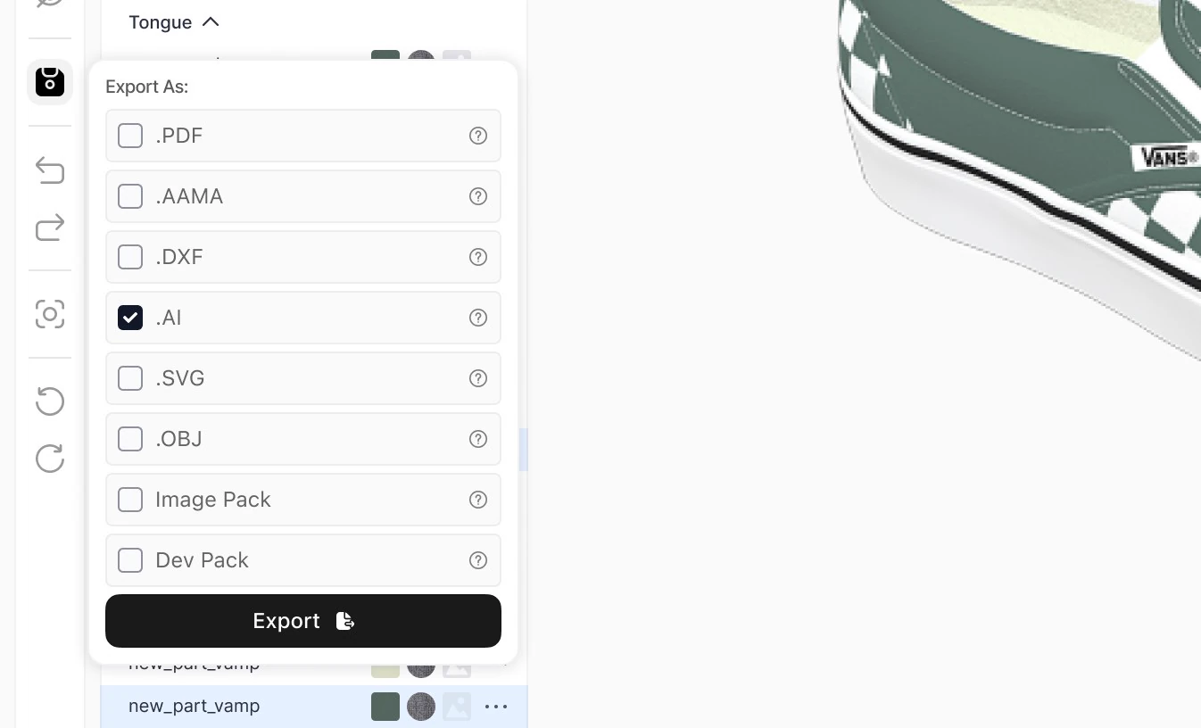
Export.
Notes is the backbone of the alignment thesis. Any designer or stakeholder can annotate a garment; public notes are visible to anyone with file access, private notes are scoped to the author. We shipped it deliberately simple for MVP — single-thread annotations with author metadata, no replies, no resolution states — because we wanted to see how designers actually used notes before committing to a heavier collaboration model. This is the feature most directly responsible for cutting the email-and-screenshot loop.
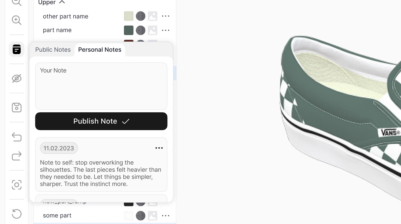
Notes.
Hotkeys were mapped from Illustrator wherever technically possible, with a persistent reference panel and hover tooltips. Lowers the learning curve without burdening the interface with onboarding artifacts.
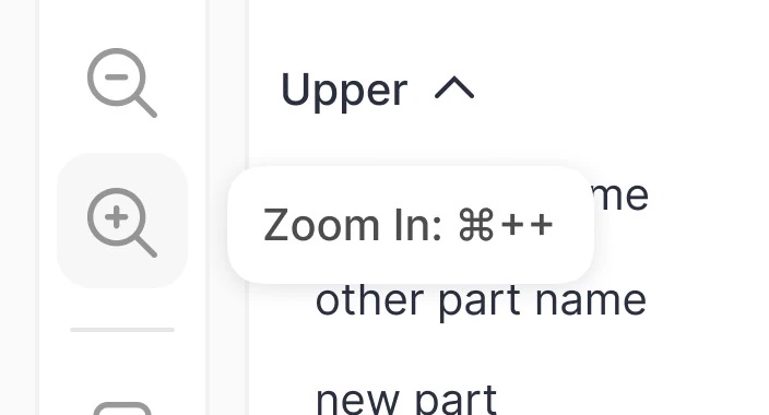
The hotkey reference.
Presentation mode hides the interface entirely. Presentations are built for whole collections rather than individual pieces, so navigation is designed around that.
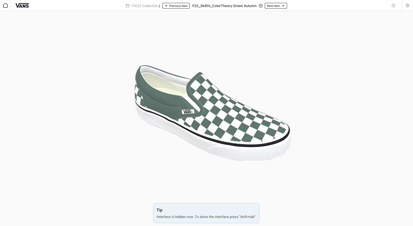
Presentation mode.
Colour, materials and graphics
All three share the same personalisation logic: multiple view modes, quick-action shortcuts, library access.
Colour needed extra care because screen colour and real-world colour diverge, and the divergence varies by material. We built configurable colour-code format options — a direct result of testing, where designers from different companies used different colour-code systems and a single hardcoded format would have slowed some users down.
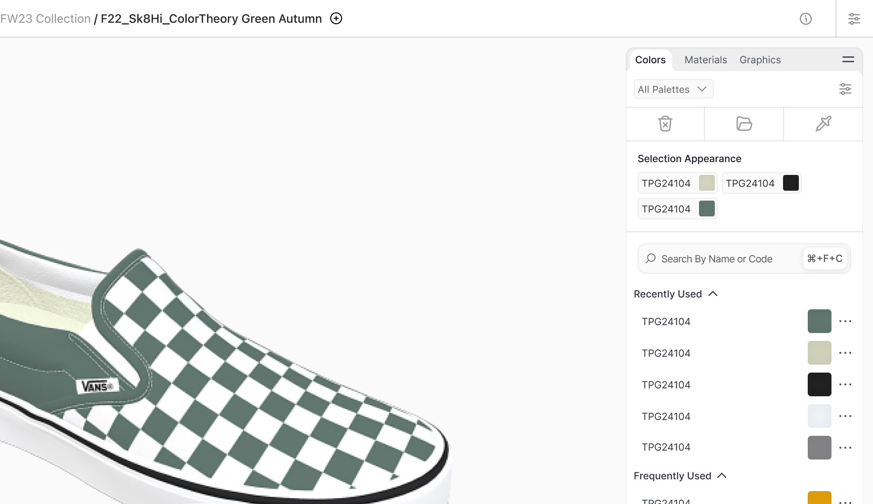
Colour selection.
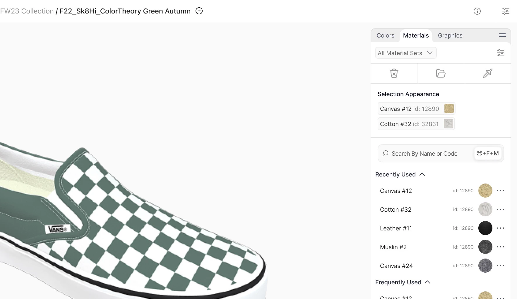
Materials apply to any part, with rendering tuned to match real-world appearance. Preview can be set to a 3D render or studio photography of physical samples. The original version offered only one preview type; testers wanted both, since photography is closer to what they’re used to seeing.
Materials.
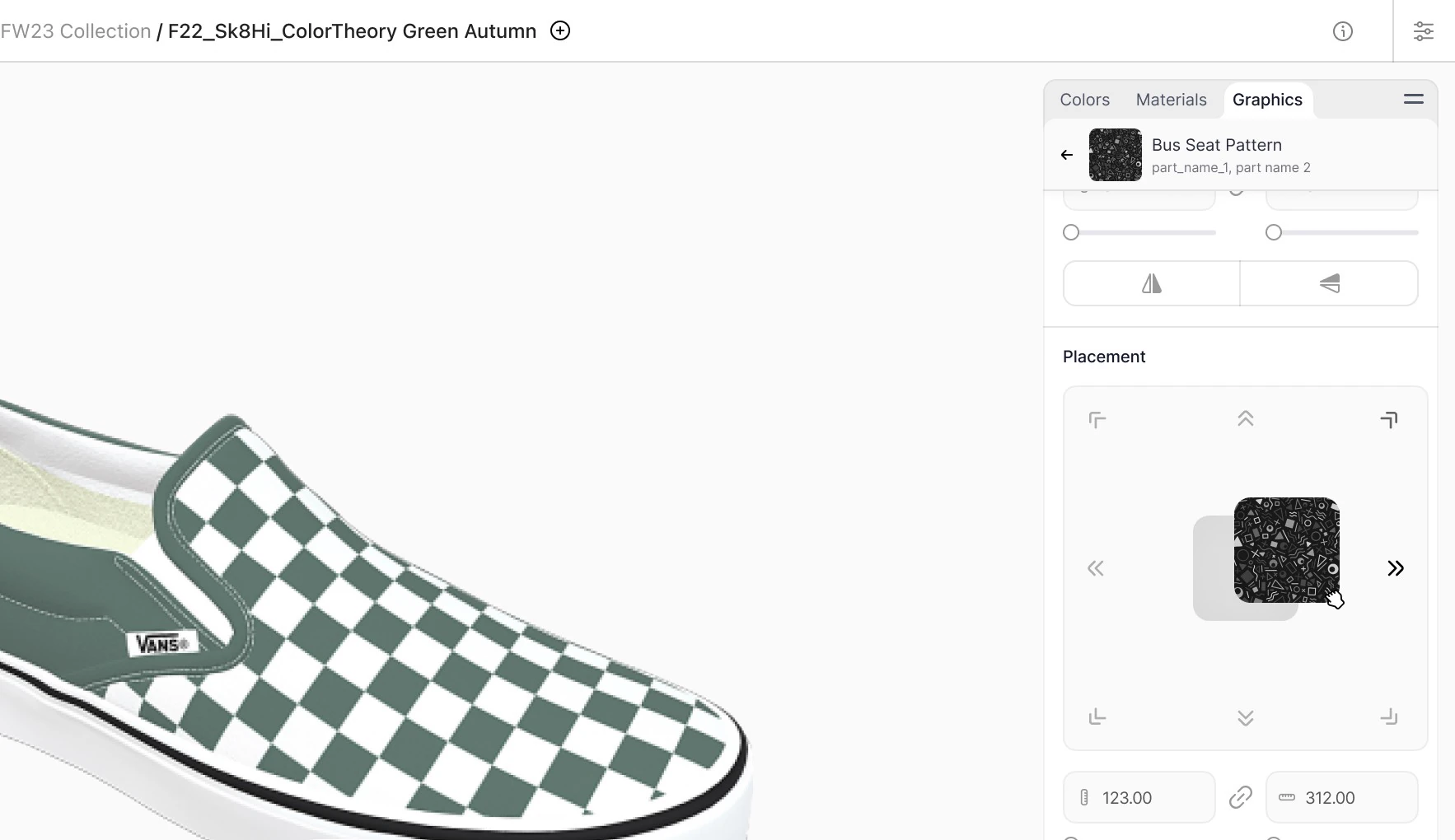
Graphics placement was the most technically constrained part of the interface and went through three iterations. Drag-and-drop on the garment surface was ruled out early by engineering on runtime grounds. Input-based controls — typing position, rotation and scale as numeric values — were killed by user testing as too slow and clunky. What shipped was physical-analogue controls: joystick-style placement with inputs for precision. It’s a real trade-off — less direct manipulation in exchange for runtime headroom that keeps the rest of the editor performant.
Graphics placement.
Multi-garment editing
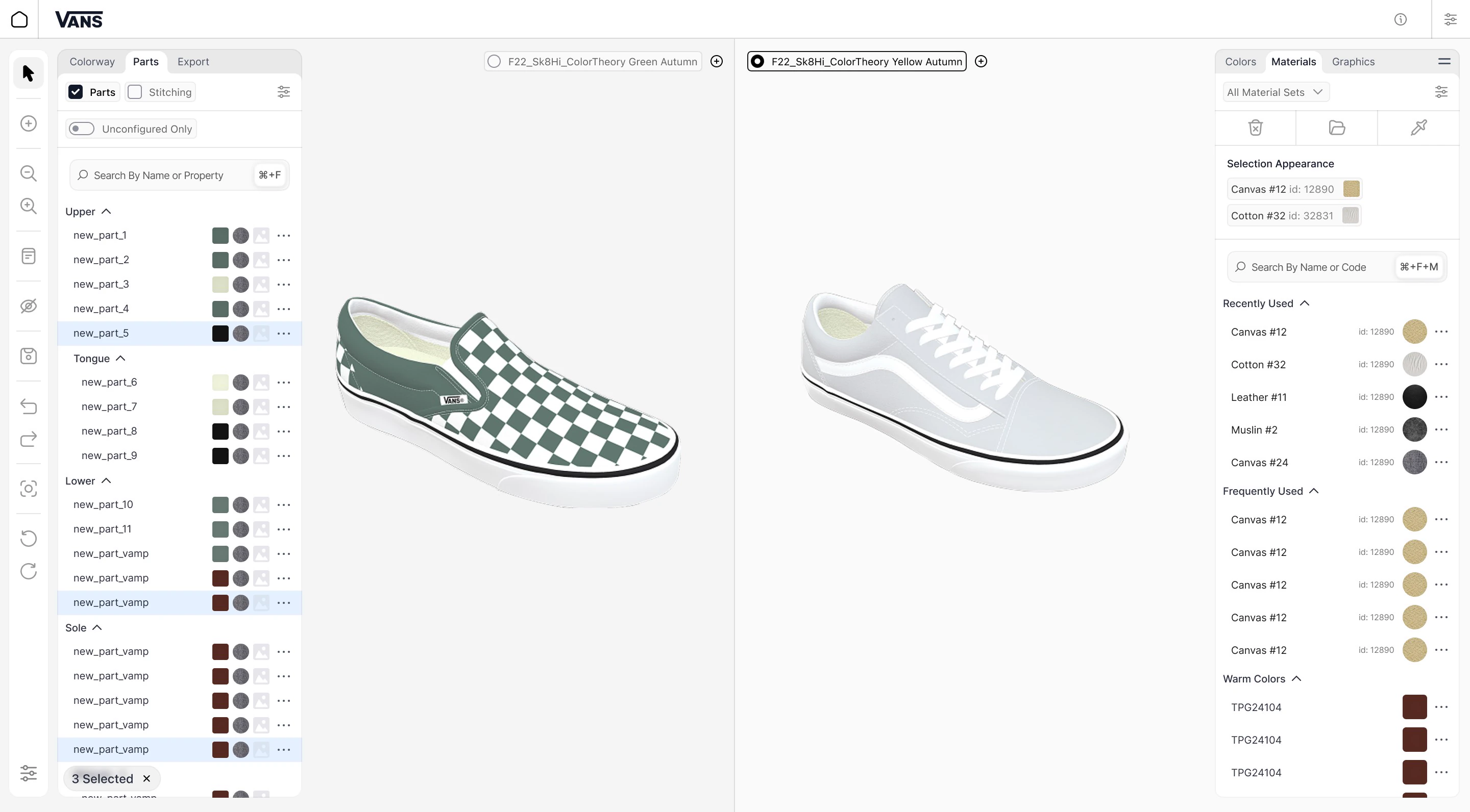
The mode holds up to 15 items, 3 side-by-side for active editing. We tested automatic context-switching and cut it — designers frequently look at one item while editing another, and auto-switch confused attention with intent.
Multi-garment editing mode.
15 items is essentially the technical limit. 3 side-by-side is the threshold designers themselves identified as the useful maximum for simultaneous editing. All windows can be manually resized, and switching the active working area is a single click on the item’s radio button.
Onboarding
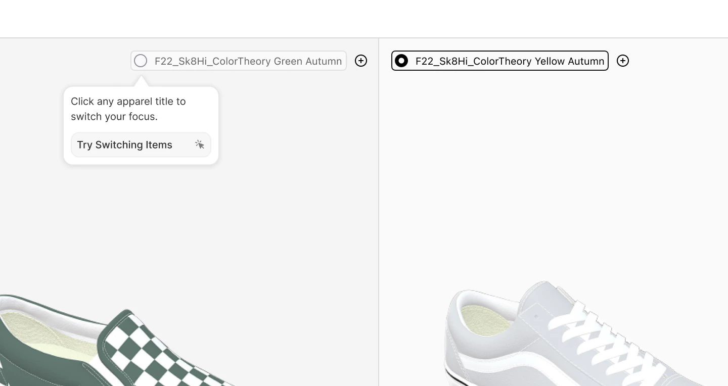
Tips appear when a user first enters each section and they can test each feature immediately, building muscle memory at first encounter. Pre-launch testing put time-to-working-proficiency at under a day with no extra guidance.
Contextual onboarding.
A meaningful share of the user base would be designers from outside VF, at corporate buyers, who would never go through formal training. If they couldn’t pick it up on their own, the platform’s alignment value collapsed on the buyer side.
The system is extensible: adding a feature requires only a new onboarding sequence for that section, and existing users who haven’t seen it are shown it automatically. The product can expand without onboarding cost ballooning.
Measurement. 20 designers in an uncontrolled test, selected for data truthfulness (a controlled test had run earlier specifically to surface design issues). Task: create a test design with at least one edit per category and save it. Average time was self-reported and compared against session recordings.
Working with the intern
I owned the complex core flows; he owned mobile, handoff edits and secondary states. He attended every testing session, and by the end was producing handoff-ready work unsupervised.
He took mobile optimisation (not the core use case), simple developer-handoff edits, and the secondary states — errors, empty, loading — that streamline a build but consume a senior designer’s time disproportionately. We worked closely on mobile, where I handled the harder layout and interaction problems and he iterated under my guidance. He asked questions throughout, and I made time to answer them.
Outcomes
Sample rounds 4–6 → 1–2. Approval cycle ~6–8 weeks → 2–4 weeks. Sketch-to-production automated. Onboarding to working proficiency: under a day.
Shipped for Vans, then Timberland and The North Face; remaining VF brands are handled by their internal team on the foundation we built.
I don’t have VF’s internal post-launch numbers, so the business framing is directional, and a phased rollout isn’t a controlled experiment.
Before vs after across the four measured outcomes.
Where each number comes from
Sample rounds. Pre-launch user testing simulation, extrapolated against existing project data. Post-launch behaviour consistent with the projection.
Approval cycle. Cycle data from VF; the post-platform figure is cut by half or more, driven by faster digital iteration and fewer physical sample rounds.
Sketch-to-production. Manual hours per garment to automated. Manual baseline sourced from designer interviews. Recovers a meaningful portion of designer hours per collection at any size.
Onboarding. Measured on 20 designers in pre-launch testing using the methodology above.
Estimated business impact and what I’d want to confirm
VF’s analytics team measured cost-per-batch impact internally and the detailed numbers weren’t shared with us. Triangulating from the input metrics — fewer physical samples produced and shipped, cycles cut by half or more, recovered designer hours — the directional effect is a double-digit-percentage reduction in cost-per-custom-batch and a corresponding increase in throughput per design team. The combination of effects, not any single metric, is where the business case lives.
Two honest caveats. I don’t have VF’s internal post-launch numbers, so the business framing is directional. And the platform shipped to Vans first, then Timberland and The North Face — a phased rollout, not a controlled experiment. The pre-launch testing numbers are clean (controlled methodology, documented sample), but post-launch business impact is correlated with our work rather than exclusively caused by it. I prefer making that distinction explicit rather than claiming around it.
Qualitative signal
Pilot testing produced executive endorsement, designer feedback that fed directly into final UX adjustments, and the kind of internal pushback that’s typical when a workflow shift this large meets long-tenured tooling. Both the feedback and the resistance were incorporated into the personalisation model and onboarding before launch.
The same order, after the project
ASOS places the same custom shoe order. A senior Vans designer and a teammate split the collection in the editor, comparing pieces in multi-garment view to keep it visually coherent. Notes flow inline, and the senior designer mentors the junior in-app rather than over email.
First iteration goes to ASOS as 3D files, no physical sample. ASOS reviews digitally and leaves annotated feedback in place. Designers apply changes within days. After a small number of digital iterations the design locks. One physical sample is produced for tactile confirmation. It matches. Production begins with budget and timeline still intact.
Learnings
Experienced designers aren’t just used to Illustrator’s features, they’re organised around its conventions. Respecting that rather than asking them to start over was the difference between an approachable tool and one that sits unused. For professionals, efficiency lives in personalisation, not simplicity.
The other lesson came from a failure. With the large previews, the insight was right and the implementation wasn’t. Holding a principle while killing its implementation is a discipline I’d install earlier.
Embed engineering from day one. It paid off most visibly in graphics placement, where what would normally surface as a late-stage rebuild became a design problem we solved together. I’d carry that model into every project crossing a real-time rendering boundary.
Design for non-linear approval chains. Large enterprise clients route work through whole departments before it moves forward. Next time I’d design milestone deliverables that convey decisions through internal chains without me in the room. Information loses fidelity in chains, and artifacts that don’t need a human escort lose less of it.
Scope research by workflow archetype, not user type. I underestimated within-group variance. The personalisation model held, but a wider archetype sweep earlier would have caught the edge cases that became late-stage design constraints.