Designing for user quality, not user volume
Context
Vidalytics is a profitable B2B video platform with roughly 2,200 paying customers. Our users are VSL, sales and marketing professionals whose income depends on video performance — they arrive highly motivated. That fact drives everything below.
Around 50 employees, revenue split between monthly subscriptions and enterprise contracts.
I’d been there about two years as senior product designer on a small product team — two designers, two PMs. This started as routine competitor research and turned into an initiative that changed how we understood our sign-up and activation funnel, and lifted ARR by roughly 5–6%.
Problem
Users completed sign-up but dropped off at activation. The obvious UX instinct was to reduce friction. The data pointed somewhere else.
Solution
Move friction out of activation and into the sign-up funnel, where it filters non-viable users earlier. Upsell hesitant-but-viable users from free account to free trial.
Outcome
Time to value −40%. Activation16.86% →20.62% (+22% relative). Trial-to-paid +14% relative. Estimated 5–6% ARR lift, shared with a parallel initiative that shipped the same day.
Role
I owned this end-to-end as senior product designer: pitched it, led the research, designed the solution, analysed the post-rollout data.
One PM collaborated on scope and development. Developers helped optimise the design for build. A marketer reviewed copy.
The strategic bet
We deliberately accepted lower sign-up conversion in exchange for higher-quality activations.
Research showed much of our drop-off was non-target users leaving on their own — useful filtering. But that filter sat at activation, the same place viable users were losing momentum. So we moved it upstream.
Most funnel work defaults to “reduce drop-off at every step.” Our research showed that wasn’t the right move. The friction that filtered out non-viable users sat at activation, which is also where viable users were struggling, taking a long time to activate or dropping off entirely.
Moving that friction into the sign-up funnel would filter non-viable users earlier while removing the barriers that slowed viable ones down. On top of that, the sign-up flow could nudge hesitant-but-viable users from free account toward free trial, where they’d get more value and convert at much higher rates.
Trade volume for quality — that’s the idea I had to pitch, defend and prove to the team.
Discovery
The legacy sign-up and activation flow, rebuilt as a Figma prototype.
Drop-off at the activation steps — upload, publish, embed — sat above industry benchmarks and well above every other step. That’s unusual: users who complete sign-up normally engage with core features at least once.
A scan of eight competitors didn’t support a UX explanation. Our sign-up wasn’t meaningfully harder than peers.
Activation funnel conversion by step, before the initiative.
The competitor scan
Vimeo, Wistia, VideoAsk, Vturb, Brightcove, Vidyard, JW Player and Kaltura. Several of the more enterprise-focused competitors presented considerably more friction than we did — requiring a personal demo, sign-up approval, or offering paid accounts only.
How I got the green light
I pitched the investigation to the senior PM in Slack with the Mixpanel numbers attached, then discussed it more thoroughly at the weekly product department meeting before research time was approved.
Wistia’s sign-up and activation flow.
Research
Five hypotheses for why motivated users would abandon after sign-up: technical issues, confusion, friction exceeding perceived value, mismatched expectations, lack of trust. Each ruled in or out against real evidence.
Four were ruled out. The fifth pointed somewhere I didn’t expect.
Technical issues. I partnered with QA to audit error logs, which showed nothing that would cause this pattern. I searched six months of Intercom tickets across 56 activation-related keywords — only 5 were relevant, all already-resolved third-party oAuth or payment issues. I then watched 100 session recordings of users who dropped off at activation, about25% of new accounts in the window. Issues appeared in 12 sessions, 9 self-resolved in the same session, and most were input-format related. Not a plausible cause of abandonment.
Side finding: about12% of users hit some technical friction during sign-up, most of it self-resolved. Not relevant to this initiative, but flagged for a separate look at how we display input fields.
Confusion. Funnel timing showed the opposite. Drop-off users completed steps 30–75% faster than users who converted, averaging around40% faster across all activation steps. Mixpanel Flows showed fewer than3% navigated back and forth. A second batch of 100 session recordings confirmed it. They weren’t struggling — they were leaving cleanly and not coming back.
The turning point: a user-market fit problem
Drop-off users weren’t stuck. They moved through steps around40% faster than users who converted, and exited cleanly without returning.
Channel data was decisive. Player-link traffic converted at0.02% end-to-end and referral at0.069%, against1.55% from organic search. Low-converting users barely touched the site before signing up — no pricing, no browsing.
They weren’t our audience, and activation was already filtering them out. The question wasn’t how to save them, but how to filter better and accelerate the users who fit.
Average time to convert vs. average time to drop off, by step.
Alternative explanations I considered
Competitor researchers doing a quick tool scan. Affiliate-program speculators. Users doing a 30-second evaluation before returning to alternatives. Each is plausible in isolation, but none explains all four patterns at once — particularly the channel segmentation gap and the near-zero pre-funnel engagement. Taken together, the signals point to low-intent non-target users.
A note on how channels are tracked
The channel figures are measured from a funnel that starts at the website landing page. That’s the only place the funnel starts this early, because Mixpanel only attributes marketing channel correctly when that step is included. Prior analysis had already established that player links and referrals bring less motivated users, while organic search brings the more motivated audience.
Solution 1 — strengthening the sign-up filter
Two small, low-risk changes: the free account option moved below the fold on pricing, and a personalised upsell to free trial based on profiling answers. Trial users converted to paid at25.43% against3.2% for free account — roughly 8x — so moving hesitant-but-viable users onto trial was worth real friction.
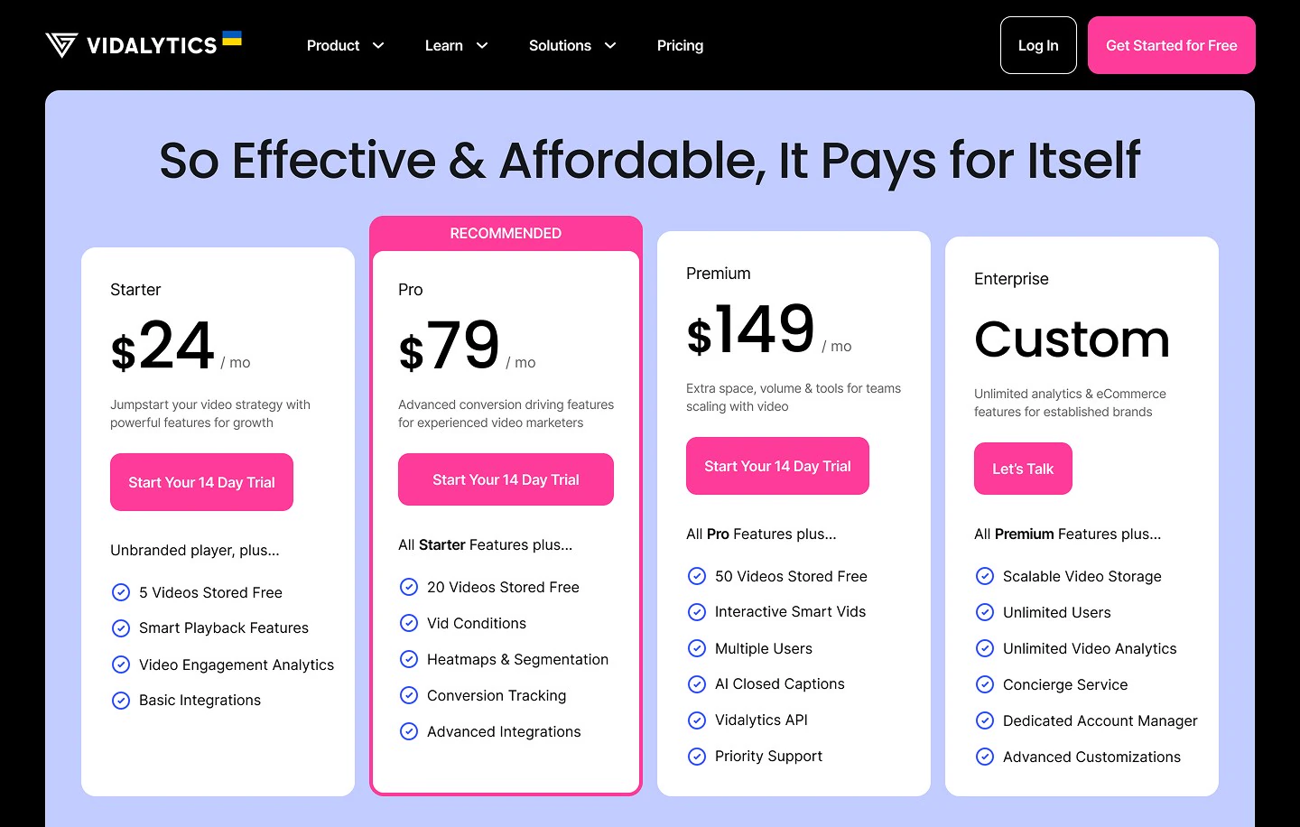
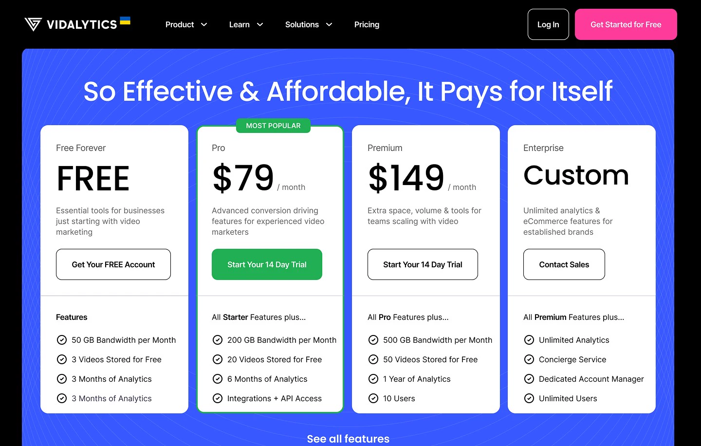
Pricing page, before vs after.
How the personalisation works
Title, body copy and bullet points all change based on which answers the user picked during profiling — 7 title and body combinations and 16 bullet point variants in total.
Why we kept both changes conservative
If the hypothesis was wrong, neither change would cause meaningful drop-off among real prospects. If it was right, they’d prove the thesis and open the door to bolder bets later — for instance, testing removal of the free account entirely.
Solution 2 — upload first
The old post-sign-up path stacked a welcome page, a walkthrough video most users skipped and an overlapping Appcues tour before anyone reached upload. Momentum was gone by then.
I rebuilt it around one question: how fast can a viable user get through upload and into vid settings, where the first aha moment happens?
Five decisions — a sub-minute welcome modal over the upload page, upload as the landing destination, multiple upload sources, a demo fallback, and smart routing for returning users.
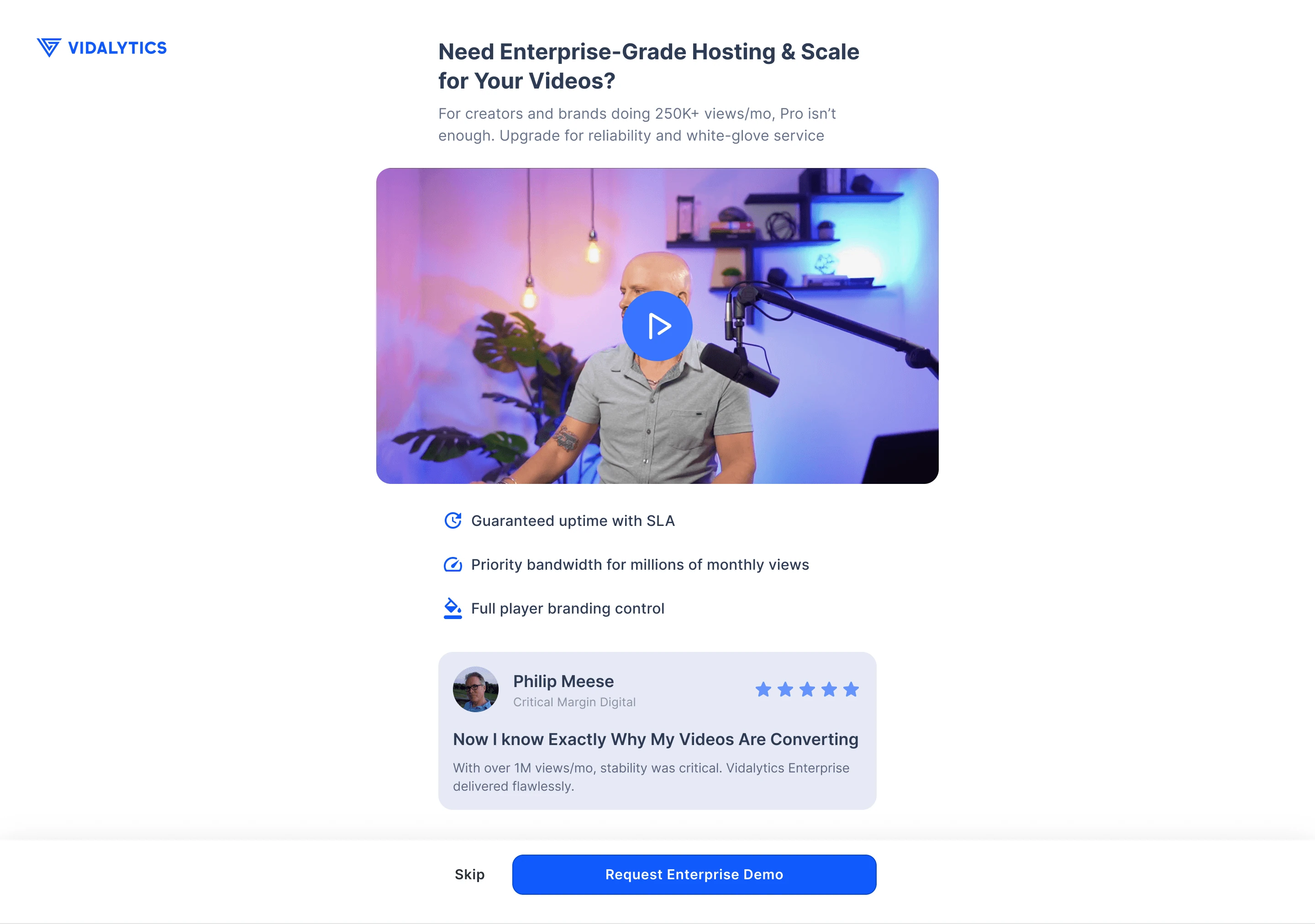
The new sign-up and activation flow.
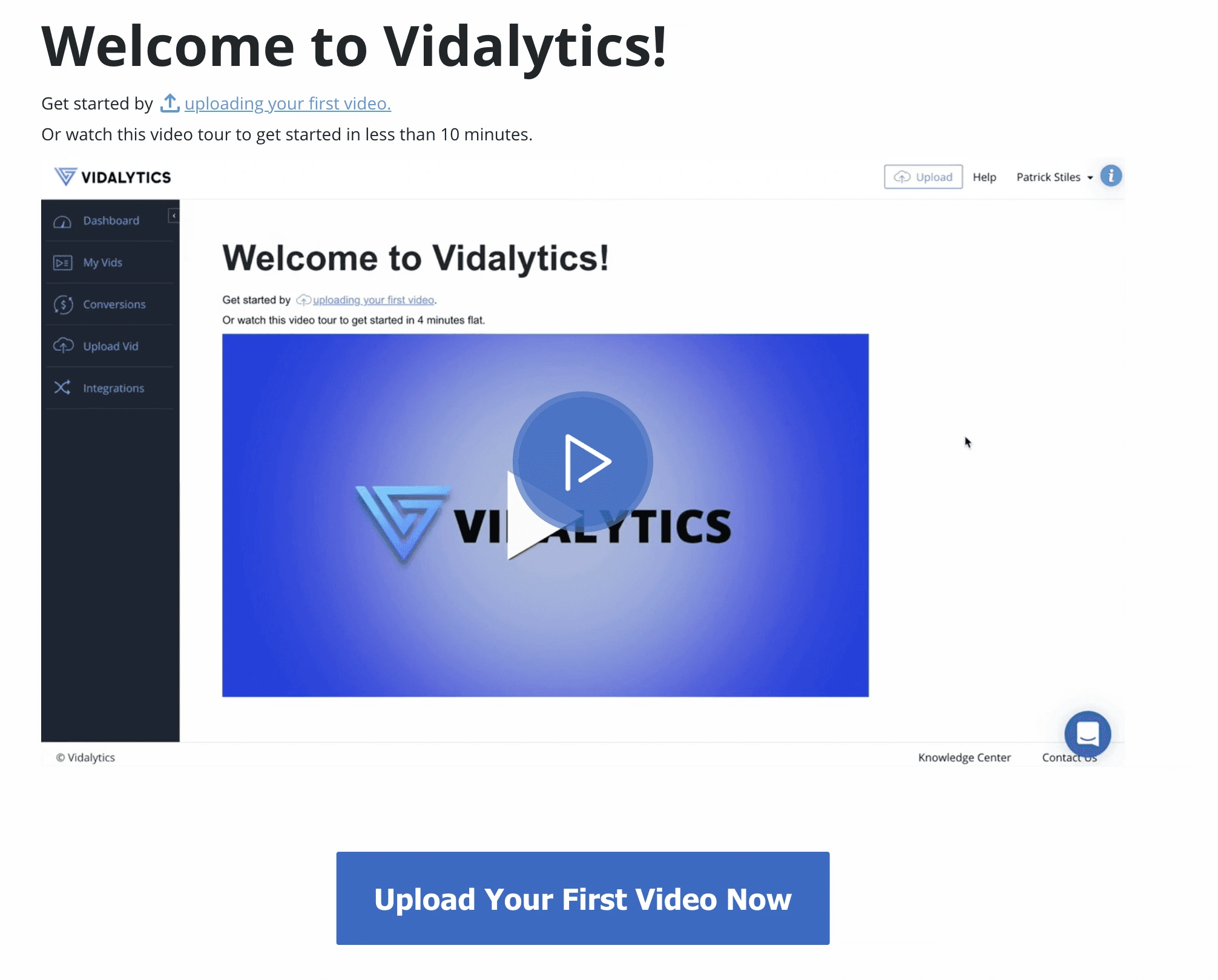
The welcome modal
Marketing pushed for a promo video in the flow, to show what a Vidalytics video looks and behaves like in practice. We were hesitant about adding one at all — the previous welcome video had been mostly ignored. We shipped it deliberately as a test: if the old one had failed on placement, a better placement should fix it. I chose a modal over a dedicated page because it doesn’t interrupt the primary flow. The user lands on upload — the prerequisite that unlocks vid settings — and the welcome surfaces over it. Marketing set the one-minute format based on our own video-performance database.
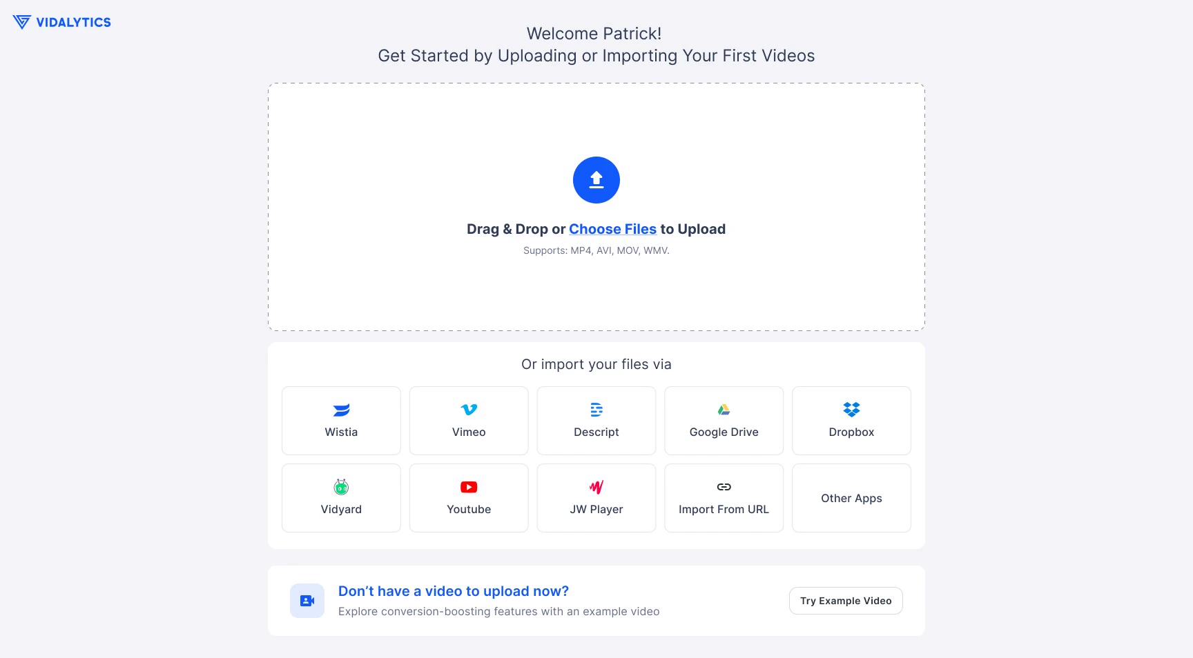
Upload as the landing destination
After the welcome, users land directly on upload, not a dashboard or generic home. I considered dashboard and rejected it: with no videos uploaded it’s an empty state with nothing useful to show. Upload is the fastest path to the first aha moment — once a video is up, users land on vid settings and see the full range of customisation, interactive elements and marketing adjustments that make Vidalytics valuable. Upload isn’t the value, it’s what unlocks it.
Lower-friction upload paths and the demo fallback
I added multiple upload sources — integrations, cloud drives, direct URL — so users could start from wherever their video lived instead of being forced through a single source.
For users without a video ready, I added a pre-configured demo so they could still experience the core settings and interactions on real content rather than hitting a hard requirement. (This one didn’t work — see What didn’t work.)
Smart routing for returning users
Non-activated returning users land on upload so they can pick up where they left off. Activated users land on dashboard, their actual workspace. The surface meets users where they are in their lifecycle.
The welcome modal.
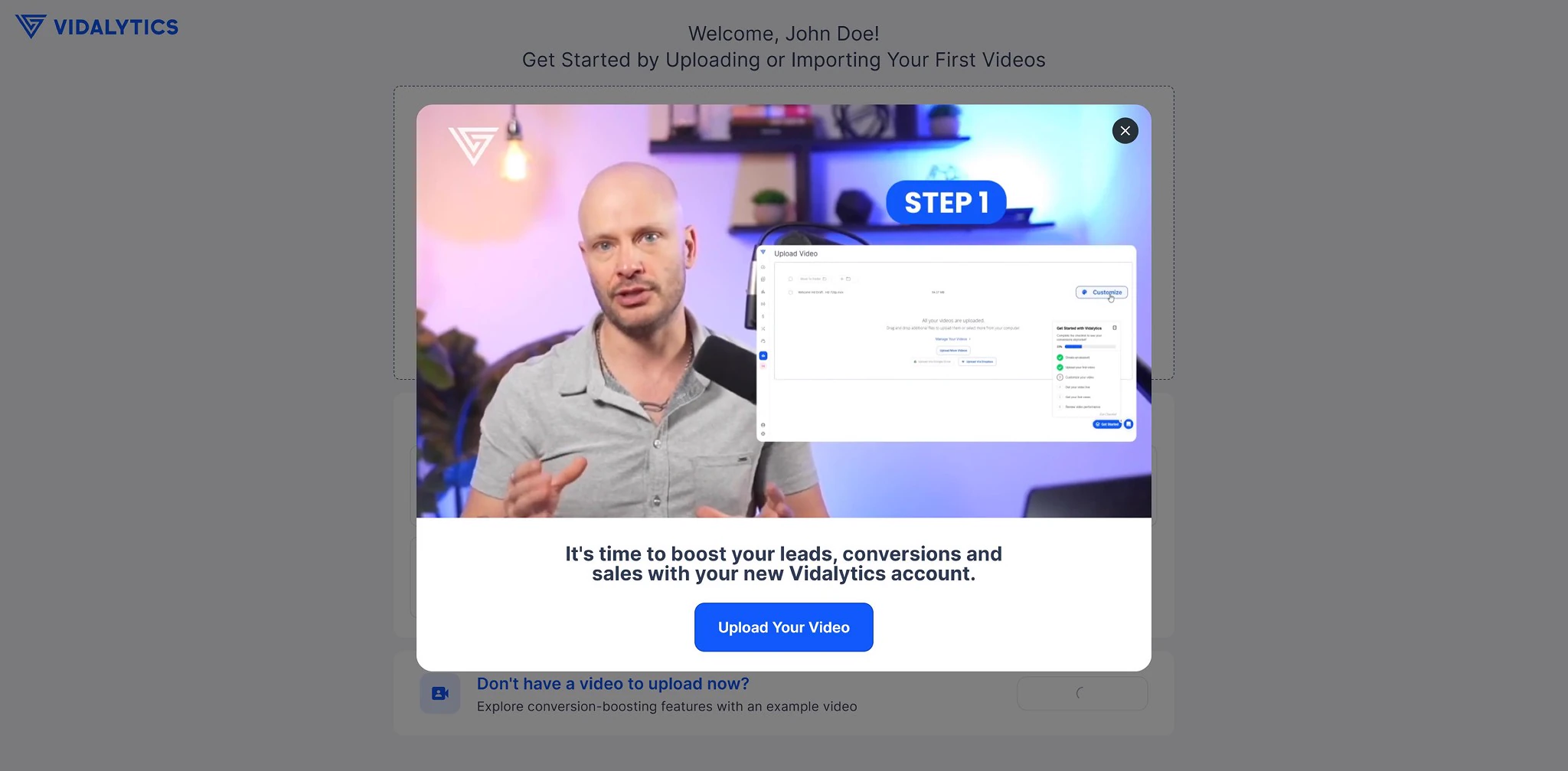
Straight to upload after sign-up, before vs after.
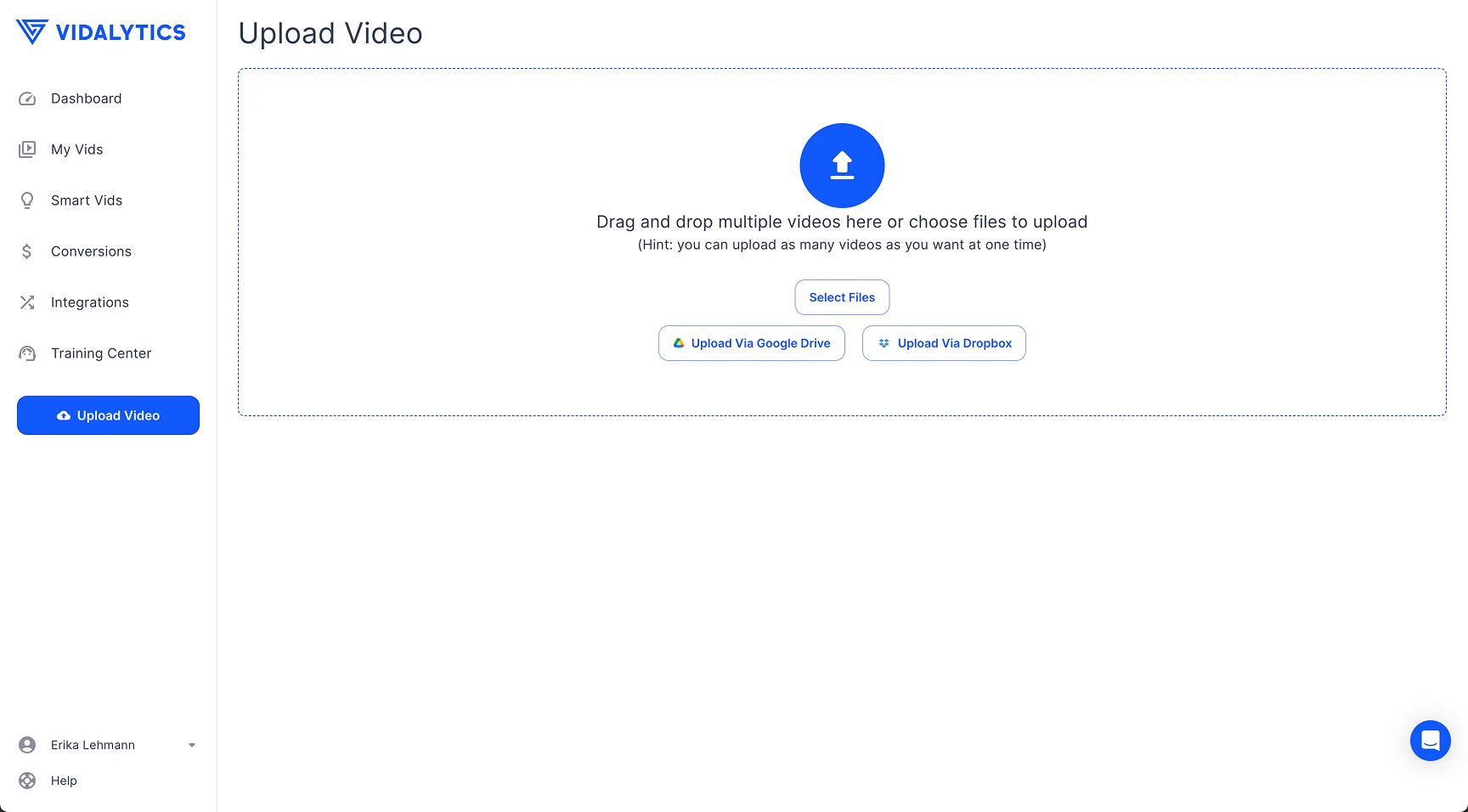
Upload page, before vs after.
The demo experience.
Selling the bet internally
I presented the research to the product department at all-hands. The sharpest pushback: hiding the free account would cost us users who’d eventually convert through it. I answered with the 8x conversion gap. The senior PM approved at the close of the meeting.
The other PM’s concern was that reducing free account visibility would lose users who would eventually have converted that way, and that we’d gain less from pushing hesitant users to trial than we’d lose in free-account sign-ups.
It was a fair challenge. I answered it with the conversion gap: free account users converted to paid at about3.2%, free trial users at about25.43% — roughly 8x. Even with significant friction from the upsell, the maths favoured the trial path by a wide margin. And the low-intent users we’d filter out weren’t meaningfully contributing to revenue anyway.
Results
Median time to activate 20.1h → 12.1h. Trial-to-paid25.43% →29.05%. Activation16.86% →20.62%. Trial share of new accounts58% →62%.
Fewer users started upload (62% →47%), but every step after it improved — a smaller, more motivated cohort going further. Estimated 5–6% ARR lift.
Two other features shipped in the same measurement window, so attribution isn’t cleanly separable.
Headline metrics, before vs after.
Full activation funnel, before vs after.
How I measured this
I used Mixpanel’s funnel tool to compare pre- and post-rollout cohorts, filtering out internal users. I built activation funnels for each cohort, then segmented by device, plan type and marketing channel to see whether the changes affected groups differently.
Cross-impacting initiatives
Sidebar Upgrade Promo and Trial/Upgrade Flow launched the same day, designed by our other designer as part of the same broader activation strategy. It had a noticeable effect on conversion to paid, so some of the trial-to-paid and free-to-trial lift can’t be cleanly attributed to the sign-up and activation changes alone.
Home Stats launched two weeks after rollout — my design. Primarily affects retention on sign-in, vid stats entry and vid settings edits, with marginal effect on conversion. I isolated the period before Home Stats launched and the numbers came out similar to the full window, so its effect is negligible here.
The sidebar promo is harder. Both initiatives were part of the same quarterly activation OKR and launched on the same date. Each contributes meaningfully to the observed lift, and the exact split isn’t separable without a more complex analysis we didn’t have data-team capacity to run.
Why each metric moved
Paid vs free cohort breakdown — the most interesting finding
Free trial end-to-end activation went from roughly24% to30%, about a 1.25x lift. Free account activation barely moved — roughly11.56% to12.37%, about 1.07x. Both improved technically, but trial users responded meaningfully while free account users essentially didn’t.
Trial users signed up with enough intent to commit to a time-limited evaluation, and when we reduced friction at activation, that intent translated into action. Free account users have less urgency by design, and a smoother path didn’t make them more decisive. Friction reduction alone isn’t enough — the path has to meet motivation that already exists.
This validates the upsell more strongly than expected. Nudging hesitant-but-viable users onto trial wasn’t just relabelling plans, it moved them onto the path where the flow improvements had nearly all of their effect. The intervention didn’t change where users struggle inside the funnel — it changed who reaches the funnel in the first place.
Free account funnel, before vs after.
Free trial funnel, before vs after.
Desktop vs mobile
Desktop conversion improved from19.58% to24.86%. Mobile barely moved (roughly5.8% to5.0%), and the mobile sample is too small to conclude anything — 40 and 35 users entering the funnel respectively, with fewer than 5 converting in each period.
On mobile, drop-offs concentrated on upload initiation more than on desktop, with other steps following the general distribution. Given that mobile is 7–9% of sign-ups and the primary mobile use case is check-in rather than creation, this is something to address separately rather than a signal about this initiative’s performance.
Desktop funnel, before vs after.
How the ARR estimate is calculated
The trial-to-paid lift (25.43% →29.05%) applied across monthly sign-up volume produces a measurable increase in new paying customers per month. Multiplied by average revenue per customer over a year, that gives the ARR contribution. On top of the direct conversion lift, the upsell shifted the free-to-trial ratio from roughly 58/42 to 62/38, putting a larger share of new users on the plan type that converts at roughly 8x, which compounds over time.
This estimate combines gains from the sign-up and activation redesign with contributions from the parallel Sidebar Upgrade Promo. The honest attribution between the two isn’t cleanly separable, so 5–6% represents the combined impact of the broader activation OKR, not this initiative in isolation.
What didn’t work
Two of my decisions underperformed. I’m keeping them here because the reflection matters more than the polish.
The welcome video. Only12.97% of users who saw the modal started it, and average watch time was8.2% of the total duration.
The demo fallback.1.65% end-to-end activation against20.62% for the upload path.
Both are candidates for rework or removal.
Welcome video: the full data and my read
48 of 370 accounts started the video. Of those,83% dropped off by second 7 and just4% watched to the end. Unmute rate was50.57%, bounce rate83.55%.
The video autoplays on mute when the modal opens, which explains the early drop-offs. That part is expected. But even among users who unmuted and actively started watching, retention was poor. That suggests the content itself wasn’t engaging enough to hold attention.
Watchers did convert better downstream —62.5% to paid vs29.05% average,37.5% activation vs28.82%. But that’s 16 accounts, of which 6 activated. Too small to trust. My honest read is that users who choose to watch an onboarding video are self-selecting for higher motivation, so the better performance is more likely a trait of those users than an effect of the video.
Retention data supports that. Watchers retained at nearly the same rates as average across every tracked action — sign-in19.75% vs19.76%, vid settings change20.38% vs20.88%, publish17.44% vs20.66%. If the video were changing behaviour we’d expect a difference. There isn’t one. It isn’t hurting anything, but it isn’t helping either.
Watcher vs average performance.
Demo fallback: the full data and my read
About7.1% of users chose the demo instead of uploading, at similar rates across free and trial (16–18%), so the choice wasn’t plan-specific.
It underperformed on every metric. End-to-end activation1.65% vs20.62%. Conversion to paid22.22% vs29.05%. Retention 2–2.5x worse across tracked actions.
The step-by-step comparison shows where the gap opens. For trial users on the upload path,80.66% complete upload,90.06% publish,58.44% copy embed,95.56% reach 10+ plays. On the demo path, only46.34% even complete the demo flow, then78.95% publish,40% copy embed,83.33% reach 10+ plays. For free users it’s more extreme — only31.82% complete the demo flow vs89.55% on upload. On mobile, demo users essentially don’t complete the funnel at all.
The biggest drop is at the very first step: completing the demo itself. Two plausible explanations. Users who don’t have a video ready may not be active video marketers, so choosing the demo may itself signal lower intent rather than neutral preference. Or the demo flow has usability issues internal testing missed, because our testers already understood the product. Either way, my original reasoning — let users explore before committing their own content — doesn’t hold up in the data.
Upload vs demo performance.
Upload vs demo funnel.
What this taught me
The biggest drop-off in our funnel wasn’t a UX problem, it was a user-market fit problem. Standard instinct — reduce friction everywhere — would have made it worse, because that friction was doing double duty: filtering non-target users while slowing viable ones down.
Now, before asking how to fix a drop-off, I ask whether we want to fix it.
Calibration. Paid-path users responded about 2x more strongly than free-path users to the same activation changes. One reading is that motivation compounds with UX improvements. Other readings are plausible — sunk-cost commitment, different behavioural baselines, different upstream friction. Whichever holds, the takeaway is the same: design interventions and target cohorts have to be paired, not treated as independent variables.
Not every decision lands. The welcome video and demo fallback both underperformed. Owning that is part of the job, and this case study is stronger for showing it than for hiding it.